top of page

Personal Branding


A true challenge for me. I haven't sketched a design for a few years so this assignment was interesting at the least. I learned how dependent I was on "ctrl+z" as a mess up on the computer can almost always be fixed in an instance.
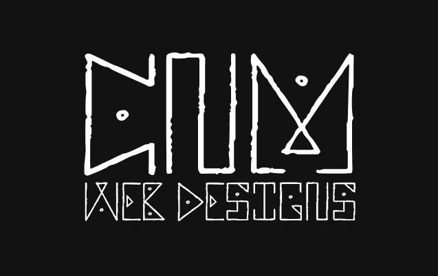
The Following Logos was where I started. I wanted something simple that captures a unique; However, I also wanted something that captures the technology side.
I then started sketching an abstract bubble letter that connects some of the letters and displays my initials on top. I liked the idea but it was capturing the web development or my style. After completing the 9th logo below, I added the one on the bottom left. This was the Design That I would choose to elaborate on further.
I thought "Maybe I could create my own font;" Then I realized the level of attention that would entail so I changed my mind and went with the one to the left directly above.
I wasn't quite sure where to start so I started making a few designs and started moving them around. I think This is the advantage of digital design over handwritten.

About the Design

I wanted to make a logo that captures a web development look. The Old English Font was unavailable on Figma—the design platform I created my personal brand with—so I looked through and found the Sankofa Display. This font captures unique characteristics while maintaining a recognizable display.


I didn't feel the design was quite ready so I began playing with different lettering. I liked the look of this one, but I didn't want to say web, and I wasn't a fan of the "N."
ree

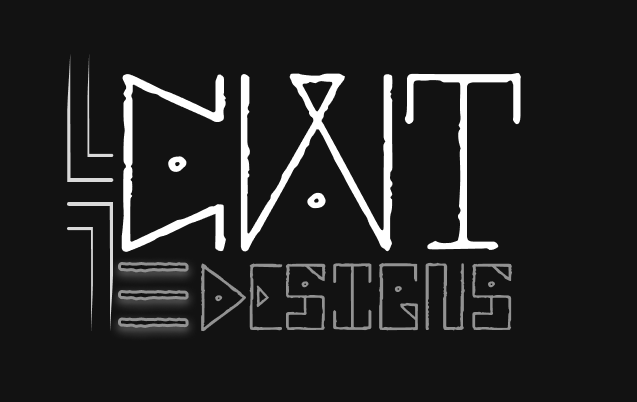
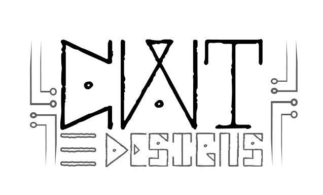
Pivotal Desing Change

When looking at the design on a white background I wasn't a fan. I changed the name to my GitHub. CWTDesigns stands for Chris-WebTech Designs, incorporating the traditional hamburger menu.


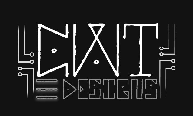
Not Sold but off to a start, I wanted to make it even more technical and technologically advanced so I added a circuit design.

Attempt to create a circuit pattern but it wasn't standing out like anticipated.

I decided to add nodes to the end as if the circuits were connected to the motherboard. I decided to fade out the lines and it almost looked like a radial mask over the design.


Comments


bottom of page